Hello Everyone!
I hope you have had a delightful Christmas time with your family and friends. And lots of gifts under the Christmas tree as well.
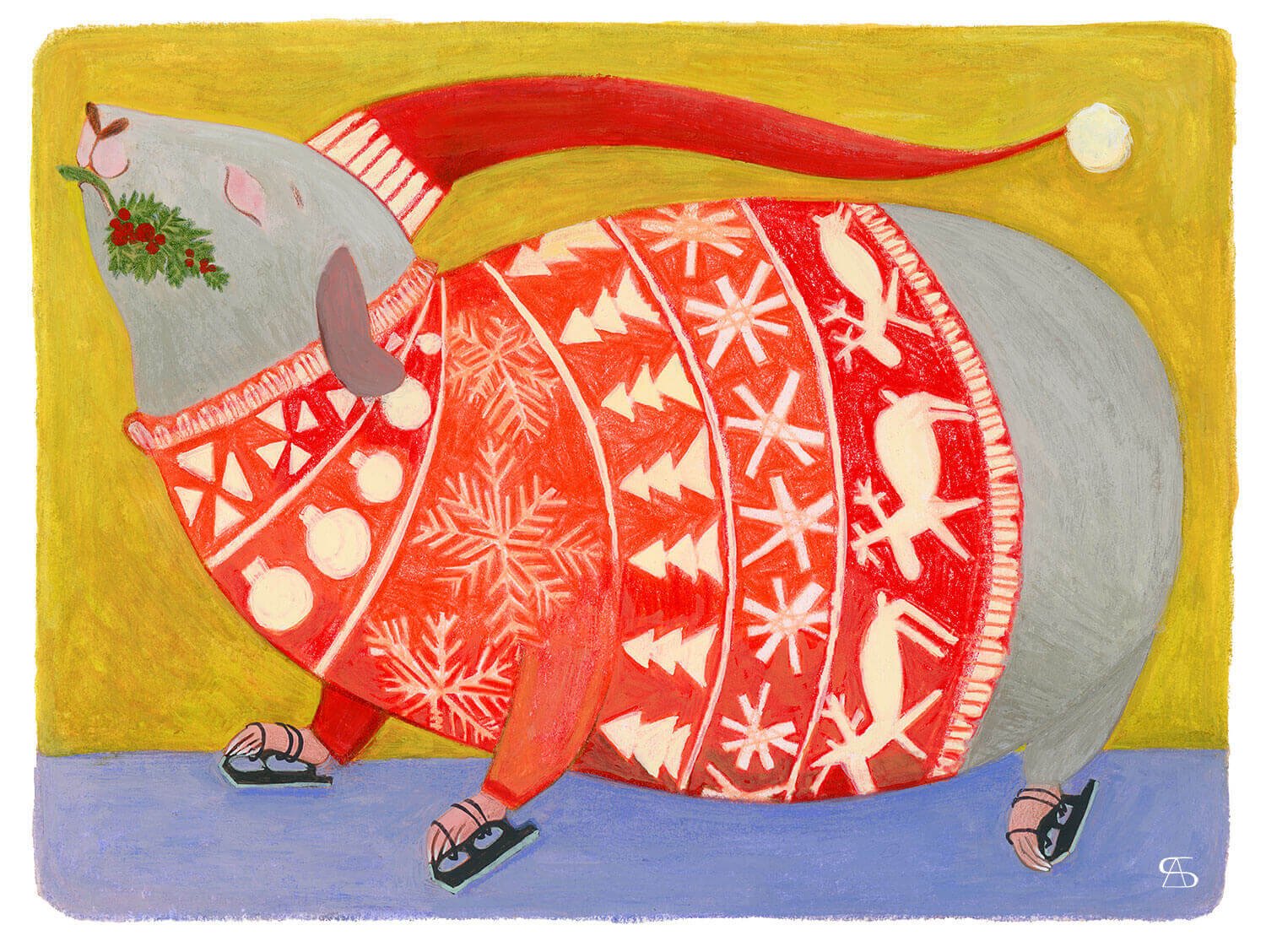
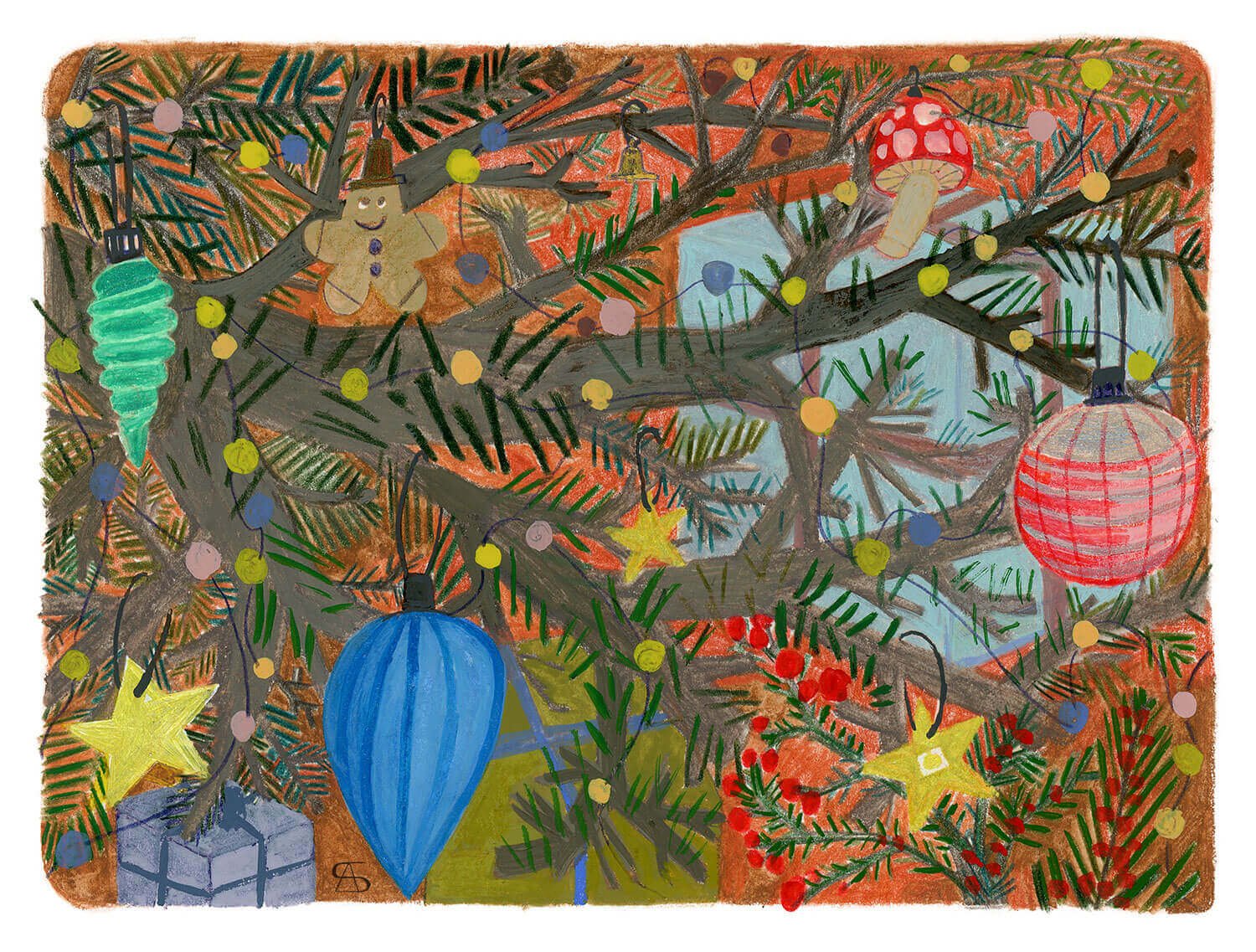
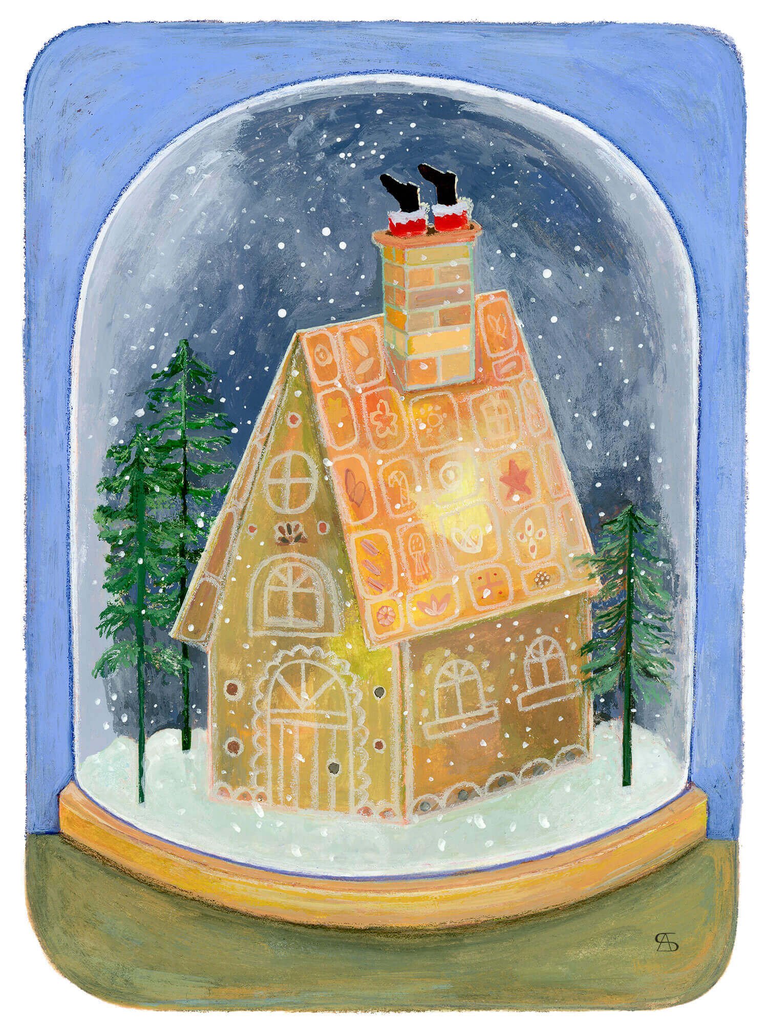
Today on the blog, I would like to share with you four Christmas postcards I have specially made for a private client. I was asked to make four illustrations in A6 format that had to do with Christmas time. I must admit I had a lot of fun creating a stuck Santa in a chimney, and a chubby guinea pig going ice skating!
Christmas guinea pig.
commission for a private client, 2021.
Gouache, coloured pencil, and water-soluble pastel, on mixed media paper. About 15x10cm.
Christmas tree decorations.
commission for a private client, 2021.
Gouache, coloured pencil, and water-soluble pastel, on mixed media paper. About 15x10cm.
Christmas rabbit.
commission for a private client, 2021.
Gouache, coloured pencil, and water-soluble pastel, on mixed media paper. About 10x15cm.
Christmas gingerbread house.
commission for a private client, 2021.
Gouache, coloured pencil, and water-soluble pastel, on mixed media paper. About 10x15cm.

